


 10-11 / 44

When choosing
furnishings,
consider the
powerful emotional
effect of color.
1 8 7 7 2 7 5 0 2 3 8
· L AW R A N C E . C O M9
m
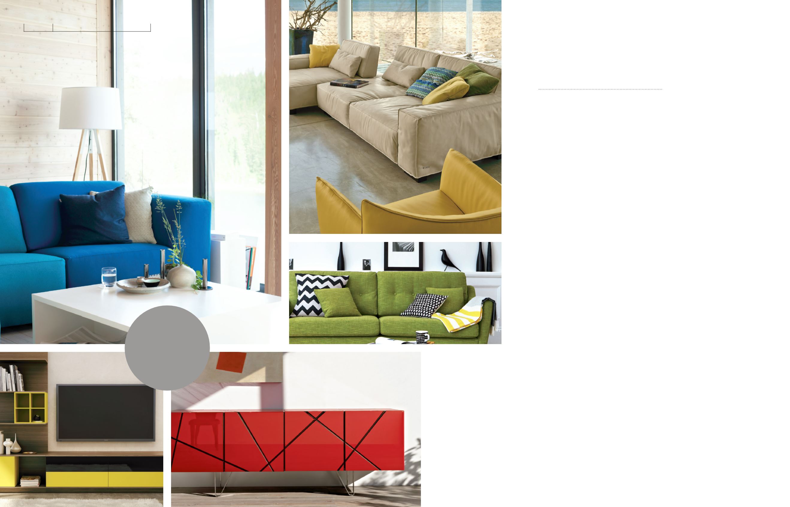
Green evokes
the freshness of
the great outdoors.
oo
Optimistic,
energetic yellow
is an ideal color
for shared spaces.
o
Exciting and
upbeat, a splash
of red enlivens
any space.
The
Language
of Color
H
ave you ever entered a room
and felt mysteriously soothed
— or immediately alert? It may
have been nothing more than color at
work. The colors used to decorate a space
can have profound effects on the way we
experience it.
Peaceful blue
The color of clear oceans and summer
skies, blue has a natural association
with coolness. The many, many shades
of blue available offer opportunities
for sophisticated emotional messaging.
Blues with red undertones can make
a room feel cozier and more sociable,
while blues with a hint of yellow can
make a room look larger and cleaner,
if not a little crisp.
Warm browns and greys
A touch of brown, warm grey, or taupe,
especially in the form of wood or
ceramics, adds an earthy and reassuring
touch of nature to a room that’s heavy
on neutrals or white. Brown and grey
are also no-brainers when it comes to
choosing floor coverings — perhaps it’s
not surprising that walking on earth
tones just feels right.
Fresh green
As anyone who has spent time in a
school knows, it’s possible to have too
much faith in green walls to keep the
peace. But, used cleverly, green really
can create an atmosphere of natural
freshness and calm. It’s also a great
color for spaces that are oriented around
food, so consider green for your kitchen
or dining room.
Airy white
As a neutral, white is always a safe bet.
Its airy, spacious, light-reflecting quality
can make small rooms look larger
and raise low ceilings. Prevent large
amounts of white from becoming too
clinical by accenting with other colors
– or, if a totally white, gallery-like space
is your dream, use texture to create
interest instead.
Elegant black
Every sophisticated room needs a
touch of black; when used as an accent,
or judiciously as a neutral, it projects
elegance and a certain warmth. When
the effect you’re aiming for is striking
and fearless, think black.
Powerful red
Associated with danger, love, and war,
red can be a very complicated color.
Red is exciting; it raises blood pressure,
grabs the attention and is thought to
stimulate the appetite, which is why it’s
so often seen in the luxurious banquet
halls of historic homes. Because red is
such an upbeat color, it may not be the
best choice for rooms where you want
serenity and calm.
Joyous orange
Like red, orange is a great choice for
spaces dedicated to fun, food, and
sociability. It’s a warm, uplifting and
optimistic color, and just a pop or two
is enough to brighten a room. On its
own, or paired with blue (its opposite
on the color wheel), orange produces
a highly stimulating effect.
Colors speak to us all by provoking
emotional and even physical responses.
Before committing to a color scheme,
consult your Lawrance interior designer
to uncover its hidden possibilities.
By mastering this most elemental
of languages, you can make a room
speak volumes.
The color you choose says
more than you might think
DESIGN
CREATE AMBIENCE WITH COLOR
oo
Blue can make
a room feel cooler or
cosier, depending on its
undertones.
o
The warm earth
tones in this room help
bring the beach indoors.